Since the industrial revolution, the mass production of industrial designs has changed our landscape so much that neo-luddites (who prefer the term "environmentalists") call for an end to all industrialization, for the sake of "recovering the environment". But it's obvious that man has not destroyed "the environment"; he has made a new environment better suited to his needs.
The new landscape is here to stay, and it will only grow. We ought to accept design, and try to be discerning about it, rather than ignore or reject it, because it democratizes discovery, improving quality of life for everyone.
So, to focus on a field of design chronically behind the rest: literature. Any designed text is a work of typography, which is usually taught with graphic design. People who study typography may work printing posters, designing typefaces, or printing books. So, now that the connection's established, let's look at designed literature as a continuum.
It started with scribes. Tablets were chiseled to be both legible and beautiful. We remember the forms of Roman numerals because they were so aptly styled. Scrolls were scribed in calligraphy, handwriting designed to beautify and illuminate the text. Some of these ancient texts (eg, The Book of Kells) were crafted so carefully they are considered art books (books viewed both as visual art and literature because the printing techniques are so integral to the presentation).
Because it was so tedious to write these texts, they were sometimes customized for their audience (eg, a book of hours), something made impractical by the printing press.
When the printing press came about, it not only made books more available, democratizing information; it democratized design. Books were no longer hand-written; they were set in typefaces, which, at first, were modeled after the handwriting of famous calligraphers (eg, Jenson's creation of the Roman). Also, page layouts could be standardized, and designers began printing books with proportions found in visual art (golden ratio, 2:3, 5:8, etc).
Though ideas evolved more quickly after the printing press, the art of printing itself was slower to change. Materials improved; kerning and leading were made progressively easier, but these were very small changes (measured in picas and points). It was not until the early nineteenth century that lithography made printing page-spreads practical, and it was almost one hundred years more before Linotype and Monotype made the printing process portable.
But, as these cheaper, easier technologies came about, design suffered. Italic fs had their edges chopped by the standard size of the Linotype machine, and true proportions were subverted by the standard em divisions of the two machines.
 |
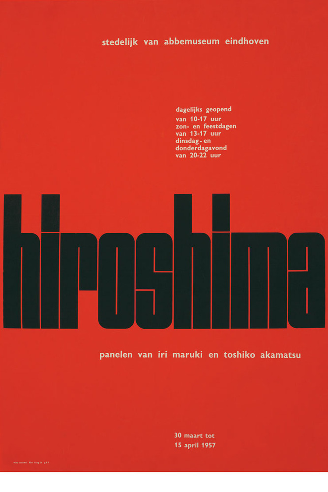
| A poster created by Wim Crouwel, a designer associated with the International Style |
The development of visual poetry intersects lithography's obsolescence at digital design, in Part Two.
This is pretty good. Nice hyperlinking, informative and involving writing. I admit to being fond of "lets go back and see how we got here" stuff, and thats done well here. Lacks a conclusion and cohesion though - even as a part it should have its focus(in this case, introduction and overview of history) to cover, and somehow preview or lead in to the part that will follow it and it's focus.
ReplyDeleteAndrey, thanks again for being my only courageous commenter.
ReplyDeleteI'm planning to add a segue to part two once I have finished hyperlinking it for posting. I put the conclusion at the end of the second part. I wanted it to be one giant post, but that would put me too far behind schedule in terms of class credit. I'm thinking of copying the posts onto one parent page when they're done. I hope that will emphasize the continuity.